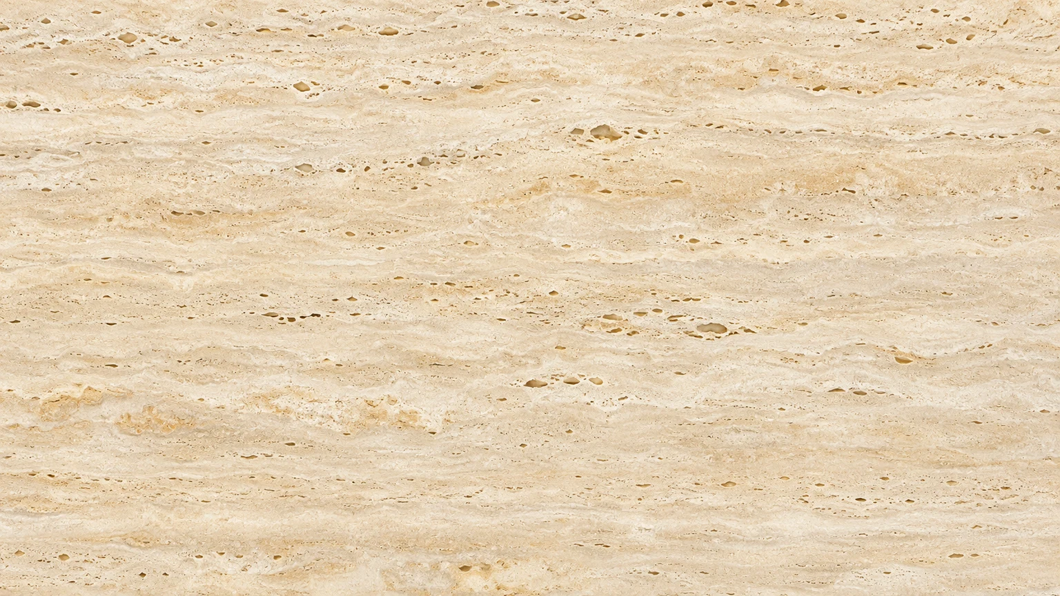
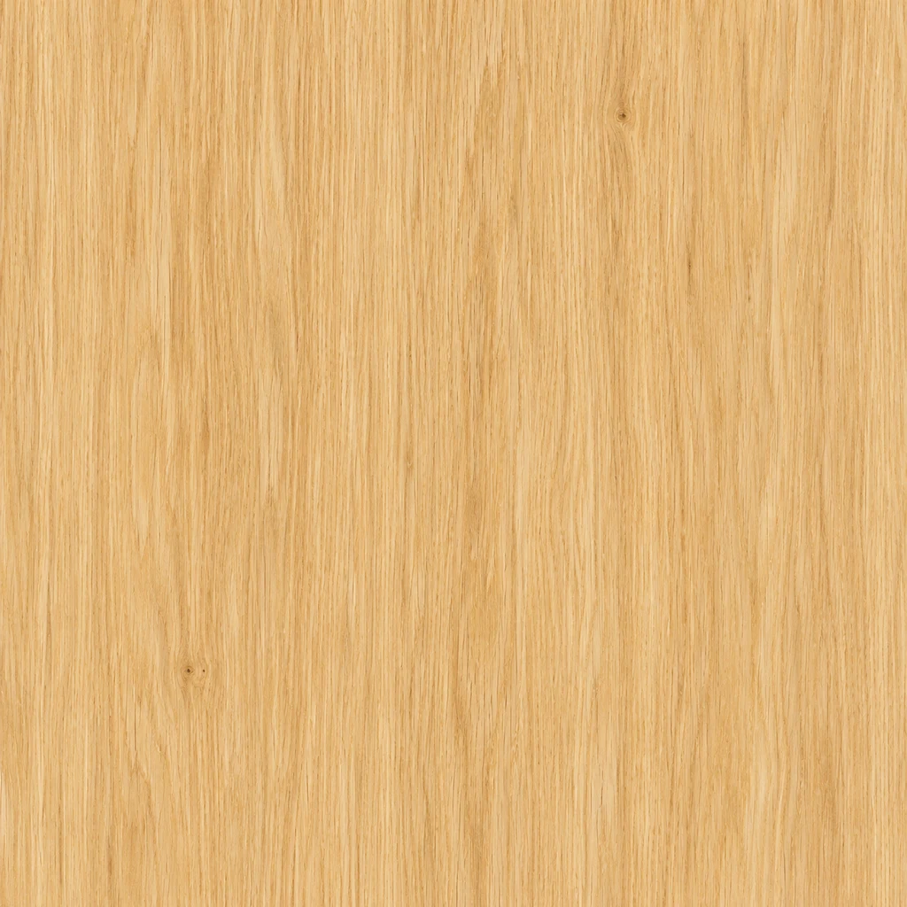
Pale oak
Fine vertical grain keeps the wood direction clear.
Texture description
Pale honey oak texture, fine vertical grain and tiny pores, few knots. Flat full-frame surface with even diffuse lighting; no plank joints.
Load this exampleStart with the material, then specify its color, grain size, direction and lighting. A useful texture shows the surface clearly without turning it into an object or scene.
LumiYingUpdated
Describe material, scale and lighting, use a reference photo, and check a texture image before adding it to a background or design.
For a poster or page background, keep contrast low enough for the foreground to read. For a material moodboard, clearer grain or weathering may be useful. Decide the display size first: a close-up of a few fibers feels very different from a wide view of cloth.
This workflow creates one square color image from text or a reference. A repeating tile needs matching boundaries; a PBR workflow also needs material setup and any additional maps required by the project. Decide which deliverable you need before generating.
Change one material property at a time so you can tell what improved.
Use a specific material such as pale oak, charcoal basalt or cotton paper. Add fine grain or large fragments, and give a direction when it matters. For brick, describe the number of visible rows; it communicates scale more clearly than asking for more detail.
Crop your photo to the relevant material before uploading. Prefer a clear, nearly straight-on view without strong shadows. A denim photo supplies color and weave; ask to remove folds and stitching rather than expecting the garment to remain. If several materials are visible, name the one to extract.
Ask for a flat, edge-to-edge surface with even diffuse lighting. Add a finish such as matte or brushed, then choose a resolution. Start at 1K to review the direction. Higher resolution gives a larger file, but does not automatically make grain finer or correct an unwanted shadow.
Check at full size and at the final display size. Look for soft patches, unwanted objects, dominant knots and shifts in grain size. Re-edit the original brief to change a property, or use Image to Image with the result when you want to refine that particular image. Before repeating it, place copies side by side and check their joins.
Change one material property at a time so you can tell what improved.
Use oak to practice direction, paper to control contrast, and denim to extract a surface from a reference. Each example loads its inputs without generating.
Fine vertical grain keeps the wood direction clear.
Pale honey oak texture, fine vertical grain and tiny pores, few knots. Flat full-frame surface with even diffuse lighting; no plank joints.
Load this example
Low contrast leaves room for text in a design.
Warm off-white handmade cotton paper texture, delicate fine fibers and faint ivory mottling. Low contrast, evenly lit; no folds, torn edges or text.
Load this exampleKeep the blue twill while removing garment folds and seams.
Use the reference's indigo color and diagonal cotton twill. Make a flat fabric texture with even lighting; remove folds, stitching, seams and background.
Load this exampleReview the image at its intended display size.
Yes. Choose a close, clear view of the surface. Describe which material to use if the photo contains several; the result is a flat texture, not a copy of the object.
Seamless edges are not guaranteed. For repeating backgrounds or 3D work, check adjacent copies and fix the boundaries in a texture editor.
It returns a single color image. It does not produce normal, roughness or displacement maps, or apply the image to a 3D model.
Images are square, with 1K, 2K and 4K settings. Check the downloaded pixel dimensions for your destination; more pixels do not change the scale of the grain.
Generation uses credits. The button shows the selected resolution's cost. Loading an example does not spend credits.
Review the image at its intended display size.
Create square texture images from a description or reference photo. Explore wood, stone, fabric and metal surfaces for backgrounds and design projects.

Create original images from a text prompt or optional reference image. Adjust the aspect ratio and resolution to bring your creative vision to life.
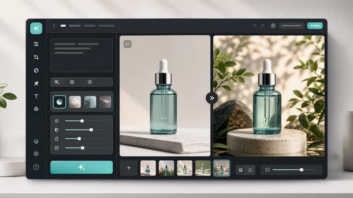
Upload an image, describe the edit, and create polished visuals for products, social posts, posters, or keyframes.
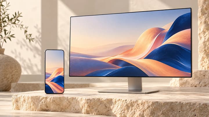
Describe your wallpaper, optionally add one reference image, and choose a screen ratio and resolution. Ask for quiet space around the clock or icons, then check the crop on your device.

Review credits and plans before generating.
Start with one material and one clear use. Refine the surface before deciding how to place it in your design.